︎︎︎
RESSÒ DE MONTBAU (2021)
(art direction, visual identity, editorial, digital)
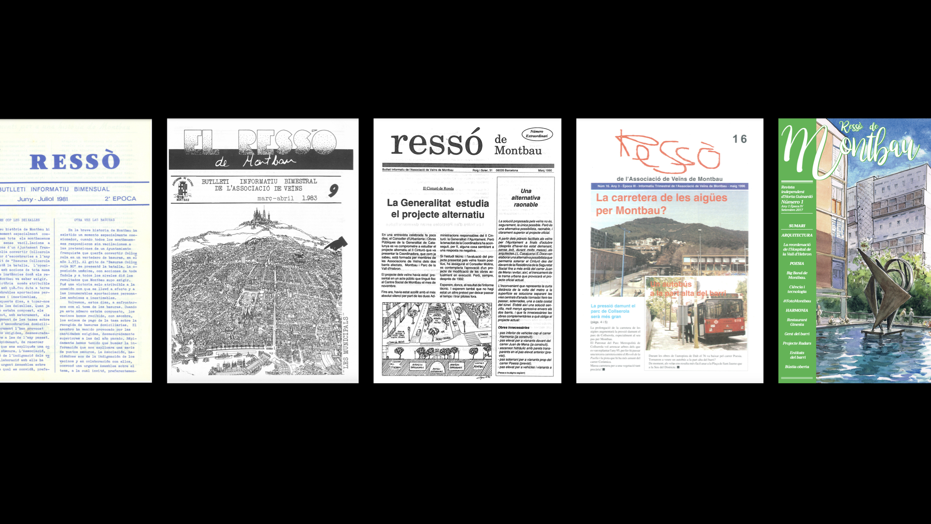
Ressò de Montbau, a community magazine established in 1976 by the Montbau Neighborhood Association in Barcelona, faced declining readership by 2007, especially among younger members. The inconsistent design and outdated management failed to engage a diverse audience.
Featured in @cargoworld
Collaboration project with the wonderful Clara Gràcia.
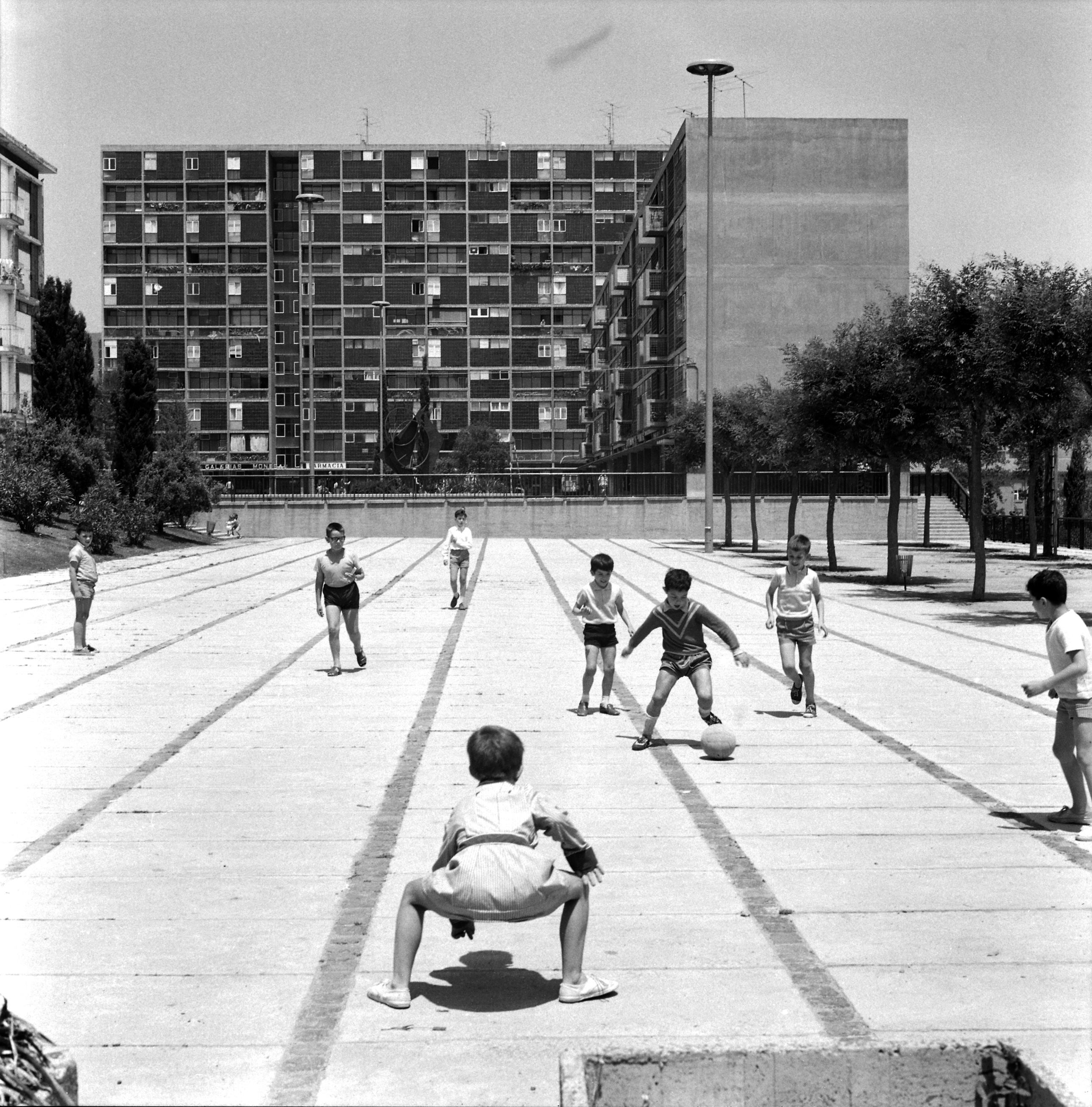
Photography by Xènia Planas and Arxiu Històric del Col·legi d’Arquitectes de Catalunya.
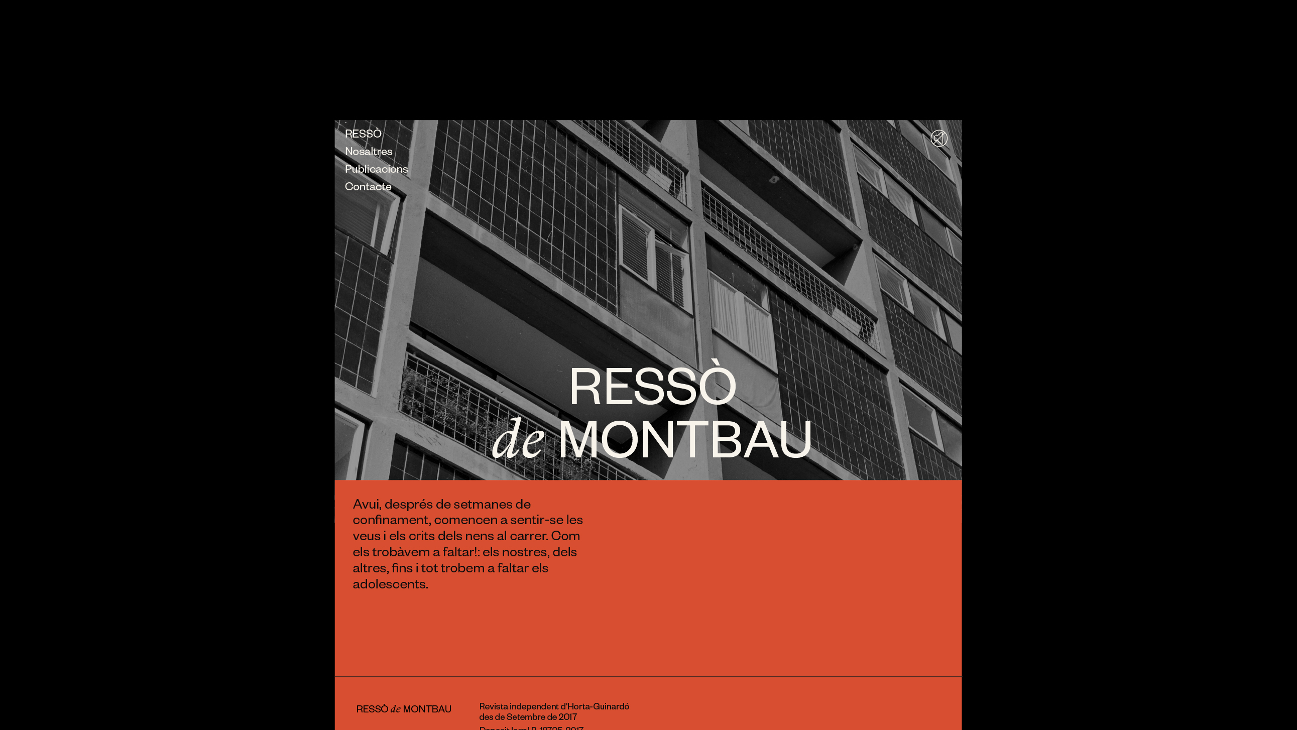
RESSÒ DE MONTBAU (2021)
(art direction, visual identity, editorial, digital)
Ressò de Montbau, a community magazine established in 1976 by the Montbau Neighborhood Association in Barcelona, faced declining readership by 2007, especially among younger members. The inconsistent design and outdated management failed to engage a diverse audience.
Featured in @cargoworld
Collaboration project with the wonderful Clara Gràcia.
Photography by Xènia Planas and Arxiu Històric del Col·legi d’Arquitectes de Catalunya.

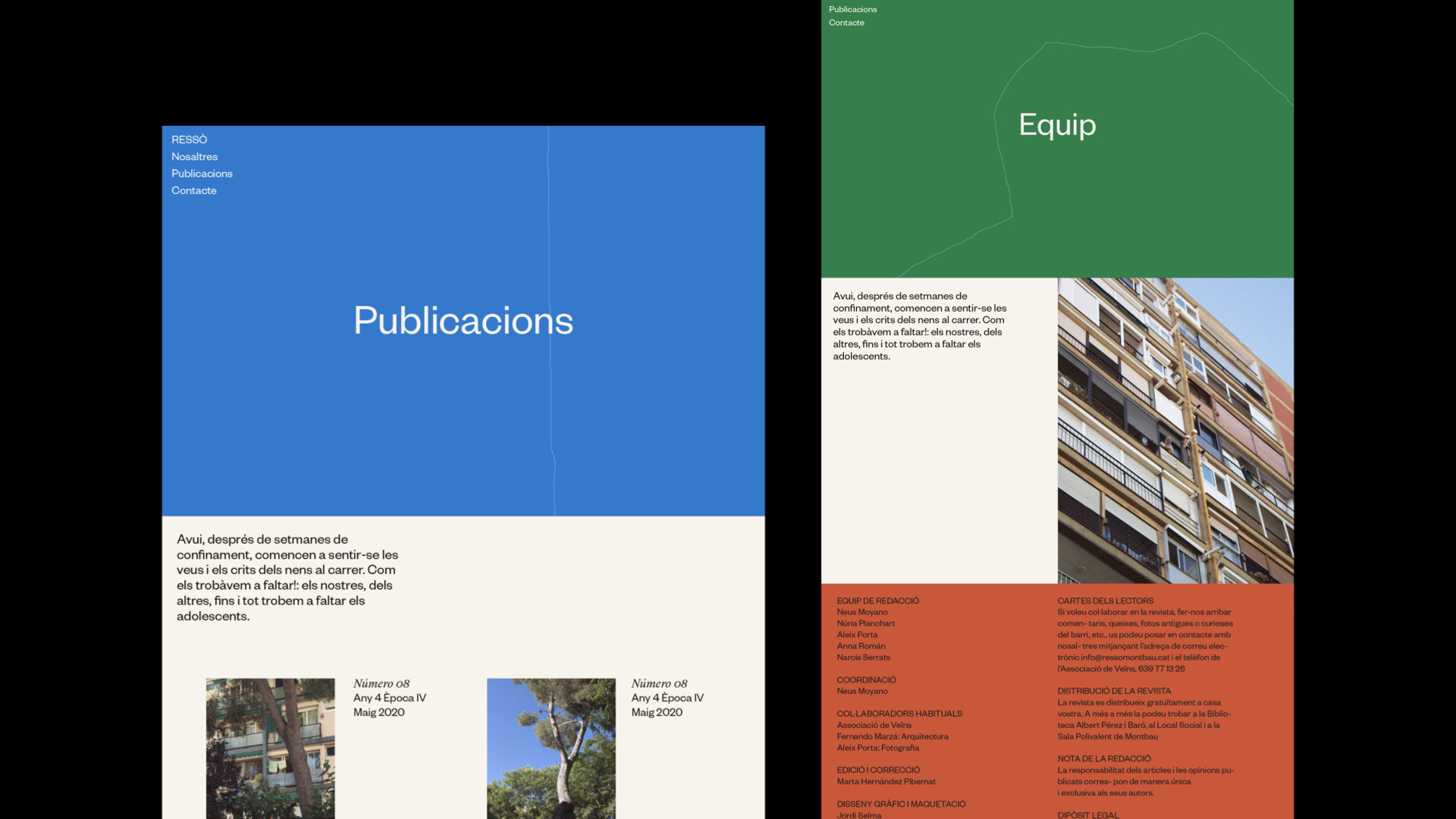
To revitalize its visual and editorial identity, we collaborated with the Historical Archive of the Architects' Association of Catalonia and engaged community members across age groups to understand their perspectives.
This informed a strategy that honored the magazine's heritage while introducing contemporary design feel. We selected a blend of classic serif and sans-serif fonts, merging Catalan tradition with a modern aesthetic, and chose a vibrant color palette inspired by Montbau's natural hues—forest, brick, and sky—to complement the traditional black-and-white archival photography.
The editorial overhaul combined historical retrospectives with current issues, featuring contributions from both veteran and emerging community voices.
The relaunch included new social media profiles, enhancing community interaction. Embracing digital media, we introduced a series of videos capturing neighborhood sounds, adding depth to the magazine's name. In Catalan, "ressò" not only translates to "echo," but also symbolizes the profound impact of an event or idea, resonating deeply within a community and sparking widespread discourse.


︎︎︎ Previous project Next project ︎︎︎